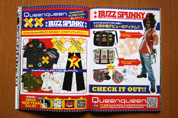
This magazine ad appeared in “men’s egg YOUTH”.
And this men’s shop made record sales figure by this magazine ad.I laid out the new items effectively while keeping this brand color.
And I used red, yellow, blue to stand out than any magazine ad.
この雑誌広告は、「men’s egg YOUTH」に掲載。
そして、この雑誌広告によって、記録的な売上高を残しました。このブランドカラーを維持しつつ、ニューアイテムを効果的にレイアウトし、
どの雑誌広告よりもインパクトを与えるために、赤、黄、青を主に使用しました。 ★Design デザイン担当


You made some decent points there. I did a search on the subject and found most individuals will agree with your blog.
This blog appears to get a great deal of visitors. How do you advertise it? It gives a nice individual spin on things. I guess having something useful or substantial to give info on is the most important thing.
Another point is recent popularity of very long names for individual code units, as in Java and .NET. A 132 character line in C++ might be incomprehensible because it contains a dozen different statements and operations, but a 132 character line in Java might well contain just a single method call with elaborate namespace and class names. Should we arbitrarily break up single statements because they're long, even though they're perfectly readable?
I must check with Jacob on that one , you actually swept through it the description but the conclusion was a little off. Well written nevertheless.
I like your blog.